.svg)

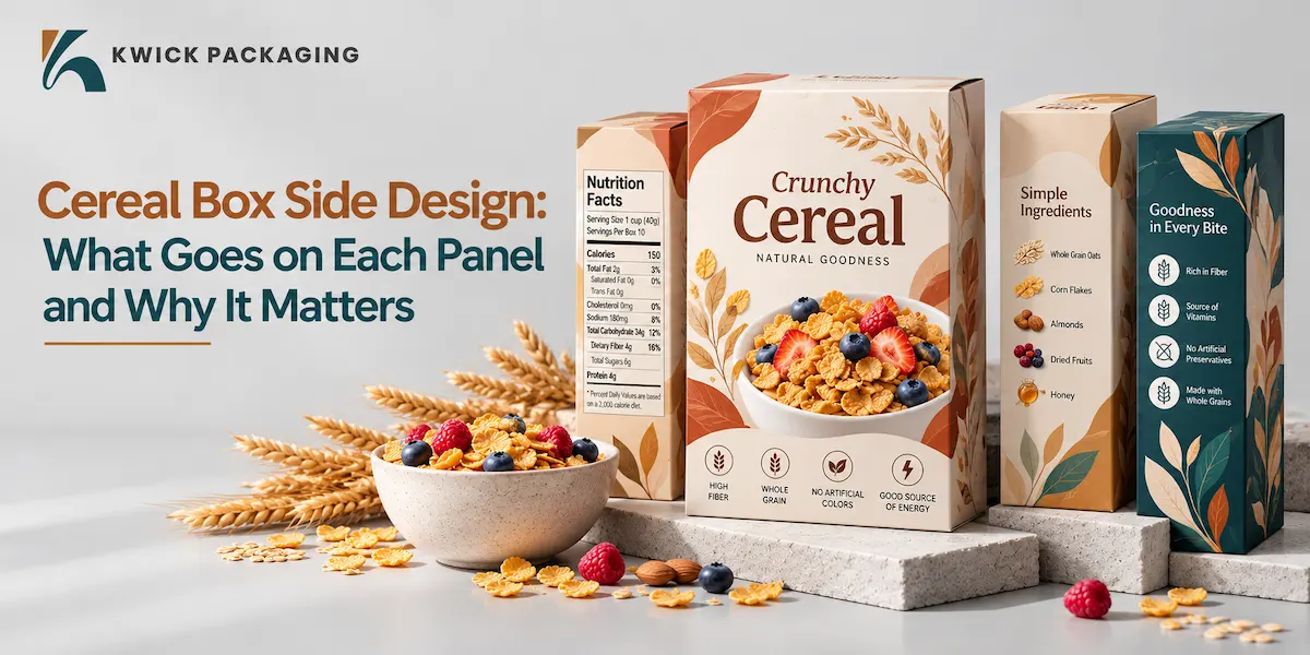
The majority of buyers look at the front side of a cereal box and pass it over. But when they get it, they pick it up and turn it over and begin to read. This is the reason why each cereal box side is worth having a plan for. In this guide you will find out what is on each panel, the size of the panel and how to use that panel to sell your cereal.
Sides Of a Cereal Box:
It has a total of six sides: front, back, top, bottom and two narrow sides. Four of them are mostly visible on the shelf to shoppers. The sides of cereal boxes are thin, yet they can be accessed when a shopper holds the pack in their hands, and therefore they bear a lot of value.
What Goes on the Front Panel?
The front has one thing to do: to be noticed at all. Keep it simple with these:
- Brand name and logo
- Product name or flavor.
- A single image or illustration.
- A single or two claims, such as low sugar or whole grain.
Whites are more important than additional text. Children's cereals frequently employ characters and vivid hues, and one study found that mascots on cereal boxes are generally tilted a little toward short shoppers. Brands focusing on health tend to be cleaner and more relaxed.
What Goes on the Back Panel?
You speak more on the back. Use it as a brief brand narrative, recipes, serving suggestions, children's games or a website and social connection. It is most effective when it seems useful rather than congested. Imagine it as a friendly conversation with the customer not a wall of text.
Why Is the Cereal Box Side So Useful?
Facts that are too small to fit on the front are ideal on the narrow panels. Food conscious shoppers tend to look at the sides initially. The prepared cereal box side can provide them with what they require within a few seconds and this creates trust before they get to the checkout counter.
Nutrition Facts and Ingredients
Most of the brands locate the nutrition facts on one side of the cereal box designs and have the ingredient list nearby. Font should be clear, contrast good and there should be enough space so that nothing is squeezed. Rules vary in different countries and therefore you should always verify local requirements prior to printing.
Claims, Badges, and Barcodes
Trust signals that include certification icons, allergy notes, and the barcode are also found on side panels. Only make claims that you can support. A plain cereal box side with some sincere badges is more trustworthy than a box full of promises.
Do the Top and Bottom Matter Too?
Yes. The bins and shelves are at the top of the aisle, hence a clever location to place your logo. The batch codes, recycling icons and best-before dates can be found at the bottom. Have these details tidy and accessible, and your box will feel like a well made one on all sides.
What Are the Standard Cereal Box Sizes?
12 inches tall, 8 inches wide and 2 inches deep approximately. Boxes with family sizes are bigger and those with single-serves are very small. The size is what will make or break the difference between your printing area, your freight bill, and the way the box fits on the shelf, so decide on it early.
How Can You Design the Side Panels Better?
Since a cereal box side is slim, small design decisions can have a tremendous impact. Try these tips:
- Rank your info and put the most important facts at the top of the panel.
- Same colors and fonts as the back and front.
- Make text short and aligned on the left side to make it easy to scan.
- Allow some distance between the barcode and nutrition table.
- Check your order by printing a mock-up and verifying it at full scale.
With Kwick Packaging, it is a common occurrence to have brands battling it out on the small panels since they fear wasting space. We would recommend that the key fact room be allowed to shine through and leave the rest. The facts are easier to read because of a small space between them.
What Mistakes Should You Avoid?
Be careful of small type, low contrast colour, and non-resembling-the-front panels. Nor should the details, which must be included, be concealed behind heavy pictures. The shoppers will be able to place the box back and choose another one in case they cannot locate the ingredients or nutrition table within several seconds. These problems can be detected early by a simple test on friends or family.
Final Thoughts: Are You Using Every Panel Well?
Each cereal box side provides you with an opportunity to inform, establish trust, and facilitate the sale. Pre-plan every panel with a specific purpose, maintain the appearance, and do a test before printing. Should you require assistance with your design being translated into a carton, Kwick Packaging is obliged to take you from sketch to shelf.
FAQs
- What would you write on the back of a cereal box?
You could include a brand story, tasty recipes, fun serving ideas, little games or a link to a website. Keep it fun. Simple so people enjoy reading it.
- Would I be able to use my sizes of cereal boxes?
You can choose your height, width and depth. You can design the box to fit your cereal, your shelf space and your budget.
- What is the common material to use with cereal cartons?
The popular material is folding carton board. It is light, easy to print on and when combined with a liner, it keeps dry food safe.
Read More: Minimalist Packaging: How Simple Design Helps Your Product Sell