


.svg)

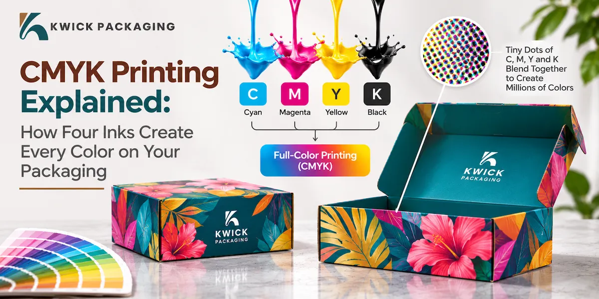
You come up with a blue logo on your screen. Then in comes the printed box, and there the blue is drab. It is an issue that vexes brands on a daily basis and it is almost always a color mode issue. CMYK printing has four inks to make all the colors that you see on a box, a bag or a label. Our daily presses at Kwick Packaging allow us to experience the wrong color and how it can be corrected.
CMYK stands for:
CMYK is an abbreviation that means cyan, magenta, yellow and key. Key means black. Each of these four colors is loaded by a printer and deposited in layers by the press. Both inks absorb some light and the remainder rebounds to your eye. Combine the four to varying degrees and you have thousands of shades. This system has remained the commercial packaging standard due to its quick, predictable and economical nature.
How Do Four Inks Make So Many Colors?
The press does not paint like a painter. It employs a clever device that deceives the eye. There are three concepts of how it works.
Halftone Dots and Tiny Patterns
The press separates every color into small dots of various sizes. Small dots allow a greater amount of paper to be visible, creating a light shade. Big dots occupy more paper that makes a deep shade. Your eye is able to bring together dots as they appear on a normal distance and perceive a single smooth color.
Why Black Gets Its Own Ink
Cyan, magenta and yellow can combine to give a dirty dark look, but seldom a clean sharp black. That issue is resolved by a separate black ink. It crisps words, gives depth and conserves ink on black regions. CMYK printing also requires black since small fonts appear blurred when three colors have to be precisely aligned.
Light Paper Does Half the Work
Inks are see through. The ink reflects the light of the white paper beneath it making the paper a fifth color. The darker the page is the more ink you add.
Why Do Screen Colors Look Different on Paper?
Light is the color of your screen. It incorporates red, green, and blue colors and light to black to create brighter colors. Ink is the reverse. It starts with white paper and takes light away. CMYK vs RGB is a contrast between light and ink and each of these has a color palette.
|
Feature |
RGB |
CMYK |
|---|---|---|
|
Used for |
Screens and photos |
Printed packaging |
|
Color method |
Adds light |
Subtracts light |
|
Color range |
Wider |
Narrower |
|
Hardest colors |
Few |
Neon, bright blue, bright green |
How Do You Convert RGB to CMYK the Right Way?
It is also common to start in RGB due to the default settings of phones, cameras and design applications. Even a late conversion of RGB to CMYK can cause color shifts that are unexpected. Never convert at the end but it will be corrected by your designer when there is still time. There are four steps to follow:
- Make sure to set up your design file.
- Select the color profile.
- Eye-check the bright colors on the converted file and fine-tune it.
- Insert bleed and retain important text.
When Should You Use Pantone?
Certain colors lie beyond four inks. Neon green, deep orange and rich metallic tones tend to be placed in this category. This is solved by Pantone inks. A Pantone ink is a ready-to-use color that the press uses as a separate plate. It is also more expensive, but is more like a brand color, run to run. Photos are printed with four color inks and the logo with one Pantone ink.
Does Paper Change Your Print Colors?
Yes, it transforms them a lot. Ink is deposited on the surface of coated paper hence colors appear sharp and bright. A container constructed of brown kraft will have a cozy, natural appearance, and light colors might appear dirty on it. CMYK printing is most effective for simple art and high contrast on kraft.
How Do Proofs Protect Your Order?
A proof contains what the press will print before it is run off. Checks layout and spelling in a digital form. A tangible test verifies actual color on the actual material. Always demand a physical order when placing a large order or a colour that is important to the brand. It is not as expensive as a complete reprint and it provides you with a clear yardstick to sanction. CMYK printing is best applied where there is a consensus on what color should be printed prior to press.
Why Does Working With a Manufacturer Help Your Colors?
The press is operated by a manufacturer who mixes the ink and examines each batch. Direct control reduces response time and minimizes errors. Kwick Packaging will preview files before production, mark colors that can change, and recommend plain-word fixes. Before you order, ask a maker about file rules, proof options and color tolerance.
Conclusion:
It begins with the correct file to create great color. Prepare your design beforehand in the color mode of the printer, test the bright colors and use a paper that is appropriate to your art. Use Pantone on important brand colors, dark rich black on big dark portions and pure black on text. By knowing about CMYK printing you can save money and keep your brand image safe.
FAQs
- Why is my printing paler than my screen?
Light is used on screens and can be brighter than ink on paper. There is a loss of brightness in blue, green and neon shades when they transfer to ink.
- What is a color profile?
A color profile is a set of tiny data that informs software how a press or paper reproduces color. The printer can inform you of the profile to use.
- Will the type of paper alter end color?
Yes. Colours are bright and sharp on coated paper. Ink is absorbed by uncoated paper and kraft board; thus colors are softer and darker.
- What shall I do to verify colour before a complete print run?
Request physical evidence on the actual material. It presents the actual colour and provides you with a clear guideline to accept.